Combining Photography and Graphics in Sign Design
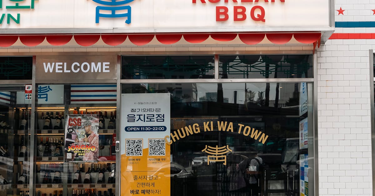
Table Of Contents
The Role of Digital Tools in Combining Media
The integration of photography and graphics in sign design has been revolutionised by the advent of digital tools. These advancements enable designers to experiment with various styles and effects, enhancing the overall visual impact of their signage. Software solutions allow for seamless layers of images, text, and illustrations, making it possible to achieve a polished look that meets branding requirements. The ability to manipulate images and graphics extensively provides a creative edge, allowing designers to tailor their projects to specific audiences.
Modern design applications also offer diverse options for customisation, ensuring that each sign can reflect the unique identity of a business or campaign. With user-friendly interfaces and extensive libraries of templates, even those with limited design experience can create striking signs. The use of digital media not only streamlines the production process but also facilitates collaboration among team members who can easily share and refine designs in real time. As a result, the combination of photography and graphics becomes a more accessible and efficient goal for sign makers.
Software Solutions for Sign Makers
The advancement of digital tools has significantly impacted the sign-making industry, providing creators with a wide array of software options tailored for various needs. Programs like Adobe Illustrator and CorelDRAW dominate the design landscape, offering powerful features for vector graphics and typography. These applications enable sign makers to create intricate designs, optimising layout and colour schemes. In addition to professional-grade software, simpler tools such as Canva and Vistaprint are also available. These user-friendly platforms cater to those seeking to produce attractive signs without extensive design experience.
Incorporating these software solutions into the sign design process can streamline production and enhance creativity. Many of these tools come with built-in templates and design elements that can accelerate workflow while maintaining quality. Sign makers can experiment with various styles and visuals, allowing for a unique brand identity. Moreover, integrating graphic design software with cutting technologies, such as vinyl cutters and printers, ensures seamless transition from digital designs to physical signage. This combination not only fosters innovation but also enhances efficiency in the sign-making process.
Practical Tips for Effective Sign Layout
Clarity should be a top priority in sign layout. Use fonts that are easy to read from a distance. Sans-serif fonts are often preferred for their straightforward appearance. Consider the contrast between text and background; dark text on a light background typically enhances visibility. Order the information in a logical manner, guiding viewers from the most critical messages to secondary details, ensuring the essential information is seen first.
Incorporating graphics can draw attention but must complement the text rather than overwhelm it. Aim for a cohesive design by maintaining a consistent colour palette. Limit the number of fonts to two or three to avoid visual clutter. The spacing between elements plays a significant role; white space can help separate components and improve overall readability. Regularly stepping back from the design allows for a fresh perspective on its effectiveness and balance.
Balancing Text and Visuals
Achieving the right balance between text and visuals is critical in sign design. Effective signage communicates its message quickly and clearly. Too much text can overwhelm viewers and dilute the intended message. On the other hand, visuals without accompanying text may leave the audience confused about the intended purpose or call to action. A harmonious blend ensures that each element supports the other, maximising the impact of the overall design.
Choosing the appropriate font size and style is essential for readability. Bold and clear typography ensures that information stands out against the background images or colours. Additionally, positioning visual elements in a way that complements textual content enhances engagement. Leaving adequate white space around text and images can improve clarity and draw attention to key information. A well-considered approach to layout allows viewers to absorb the message quickly, fostering effective communication.
Case Studies
Successful sign designs often result from thoughtful integration of photography and graphic elements. One notable example is the use of bold imagery paired with minimal text in a campaign for a local café. The café’s outdoor signage features a high-resolution image of their signature dish, enticing passers-by while the minimalist design ensures that the impact of the image prevails. This approach not only attracts attention but also conveys the essence of the café’s offerings in an instant.
Another effective campaign is seen in retail signage that highlights seasonal promotions. In this case, a combination of vibrant graphics depicting seasonal themes alongside clear promotional text encourages customer engagement. The balance between an eye-catching visual and informative content creates an inviting atmosphere that draws customers inside. These examples illustrate how the careful blending of photography and graphics can significantly enhance the effectiveness of sign design.
Learning from Effective Campaigns
Successful sign designs often draw inspiration from effective marketing campaigns. Observing how brands integrate their visual identity with clear messaging can provide valuable insights. For instance, campaigns that utilise bold imagery alongside succinct text can create a strong emotional connection, making the message memorable. By analysing these strategies, sign makers can craft designs that resonate with their target audience.
Examining a variety of campaigns reveals the importance of adaptability in design. Different environments and contexts may require unique approaches. A campaign that works in an urban setting might not have the same impact in a rural area. Being aware of these variances aids in the creation of signs that not only attract attention but also communicate effectively, ensuring they serve their intended purpose in diverse locations.
FAQS
What are the benefits of combining photography and graphics in sign design?
Combining photography and graphics in sign design can create a more visually appealing and impactful message, attracting attention and enhancing brand recognition. It allows for storytelling through visuals, making the sign more engaging and informative.
Which digital tools are best for sign design?
Popular digital tools for sign design include Adobe Illustrator, CorelDRAW, and Canva. These software solutions provide various features for combining graphics and photography, enabling sign makers to create professional and striking designs.
How can I achieve a good balance between text and visuals in sign design?
To achieve a good balance between text and visuals, ensure that the text is legible and complements the imagery rather than overwhelming it. Use contrasting colours, appropriate font sizes, and leave enough white space to maintain clarity.
Are there any specific case studies that highlight effective sign design?
Yes, many successful campaigns have incorporated the combination of photography and graphics effectively. Reviewing case studies can provide insights into design strategies that resonate with target audiences and drive engagement.
What practical tips can I follow for an effective sign layout?
For an effective sign layout, focus on clear hierarchy, ensuring the most important information stands out. Use a limited colour palette for coherence, choose high-quality images, and consider the viewing distance to enhance readability and impact.
Related Links
Responsive Design Techniques for Mobile Signage ApplicationsAnimating Signs: Bringing Digital Displays to Life
Incorporating Customer Feedback into Digital Design Iterations
Software Tools to Elevate Your Digital Sign Designs
Digital Signage Trends Shaping the Future of Sign Writing
Utilizing Typography to Enhance Sign Legibility
Exploring Colour Theory in Digital Signage Development
Integrating Vector Graphics for Effective Sign Design